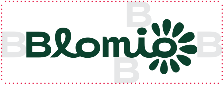
The Blomio logo consists of the brand name and a flower-like letter o. The logo has a soft, naturally flowing design language. The letter l resembles a shoot rising from the ground, and the final o forms a symbol representing a flower.
The logo is clear and also works well on top of background images. However, always make sure there is enough contrast and good visibility.
The primary version of the logo is dark green (Blomio Green). The secondary logo versions are white and light green, and they are used only on dark backgrounds.
The logo’s clear space is defined by the height of the letter B. Note that more empty space is left above the logo than below it.
Clear space
Never
change the proportions of the logo
add colours or effects to the logo
change the shape or colour of the flower symbol
stretch or distort the logo
Always use the original logo files.
Icon
Blomio has a separate icon based on the flower symbol in the logo. The icon is used in situations where the logo and brand have already been introduced. It is suitable for example for the back and side panels of packaging and other secondary applications. The icon is never used on the same surface as the logo.
Colors
The Blomio colour palette consists of muted and bold shades of green, complemented by bright accent colours. The lighter shades are mainly intended for backgrounds, while the darker shades can be used for both backgrounds and typography.
Colour use follows strict guidelines. The most important rule is that Blomio Green is never used as a background colour. Backgrounds always use BG Green.
Blomio Green
PMS 3435C C95 M55 Y90 K45 R0 G63 B47 #003f2f
Additional & Packaging Colors
Blomio brand colors
Pattern Green
PMS 554C C82 M50 Y77 K40 R40 G79 B60 #284f3c
BG Green
PMS 3435C C95 M55 Y90 K45 R0 G63 B47 #003f2f
Sage
PMS 558C C33 M16 Y37 K0 R186 G207 B178 #bacfb2
Bright Green
PMS 2295C C10 M0 Y55 K0 R237 G244 B140 #edf48c
Avocado
PMS 2304 C30 M0 Y70 K20 R154 G186 B94 #9aba5e
Tangerine
PMS 2027C C0 M81 Y71 K0 R251 G90 B80 #fb5a50
Blush
PMS 706C C0 M17 Y5 K0 R255 G218 B227 #ffdae3
Sand
PMS 9240C C3 M8 Y8 K0 R247 G234 B230 #f7eae6
Soil
PMS 4695C C45 M75 Y85 K50 R91 G48 B27 #5b301b
Typography
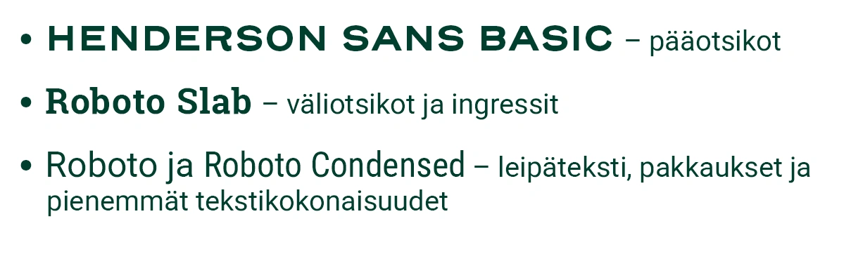
Blomio’s typography is based on three font families.
Typographic principles
Main headings use Henderson Sans Basic Black or Bold. Headings are always set in all caps. Leading is 1–2 pt larger than the font size, and tracking is -10.
Subheadings and lead paragraphs use Roboto Slab Regular or Medium. Leading is 4–6 pt larger than the font size, and tracking is -10. The type size of a subheading must never exceed that of the main heading.
Body text uses Roboto Regular. Small headings can use Roboto Bold or Roboto Condensed Semibold. Where space is limited, Roboto Condensed is recommended.
Imagery
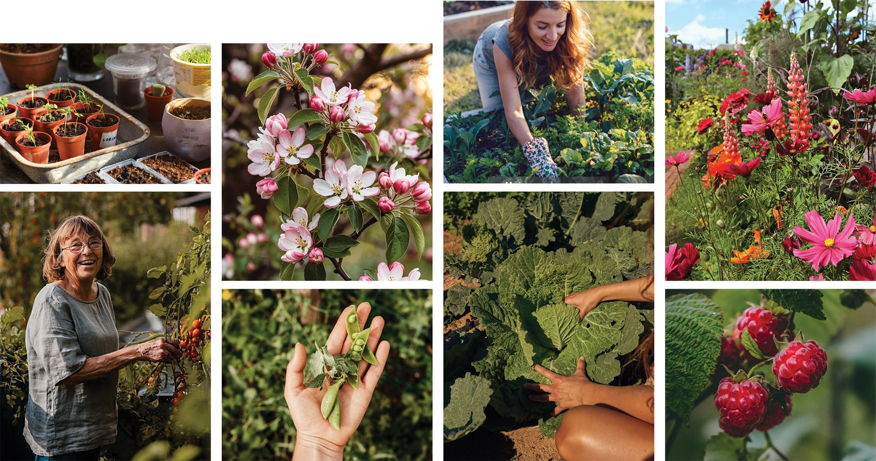
Blomio’s photography style is abundant, soft and sun-warmed. The light is soft and the images have a slightly reddish-golden tone. Avoid coolness and harsh contrasts; the light casts soft shadows. In mood, the images feel more like an August evening than a June midday.
People are photographed in natural situations in the garden or among plants. Avoid posed shots and focus on genuine activity. The images should feel true to life and authentically lived-in. People are active participants, not models posing for the camera.
Plants are photographed at the peak of their growth or harvest season. Close-ups highlight abundance, deliciousness and vitality. Products are shown primarily in their real-life setting, so their purpose is easy to understand.
If products are photographed in a studio, the setting is styled to look as natural as possible. Pay special attention to the lighting: instead of flat or harsh studio light, aim for the soft, dappled feel of evening sunlight.
There’s no need to emphasise brand colours in the elements of the images. The natural green of the plants forms the dominant colour scheme of the images.
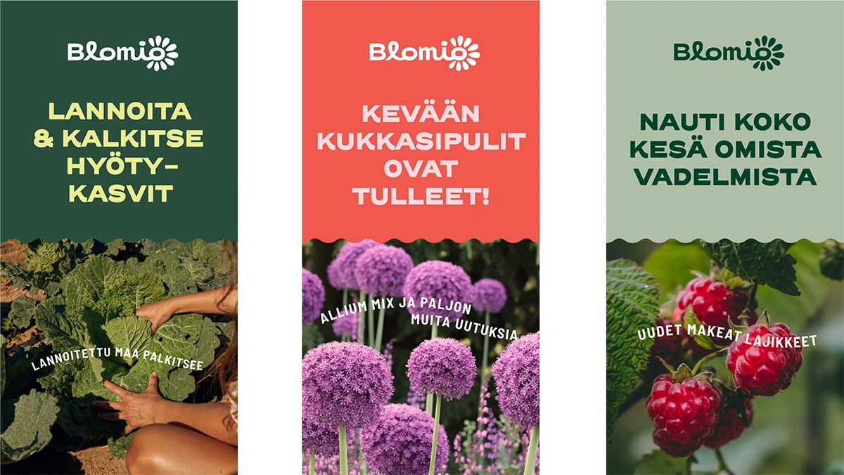
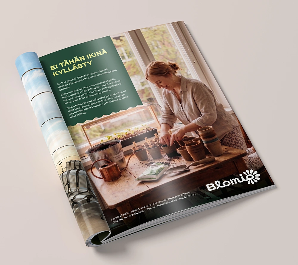
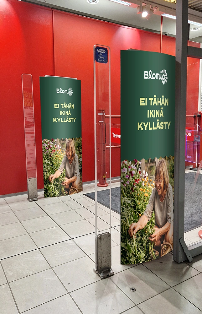
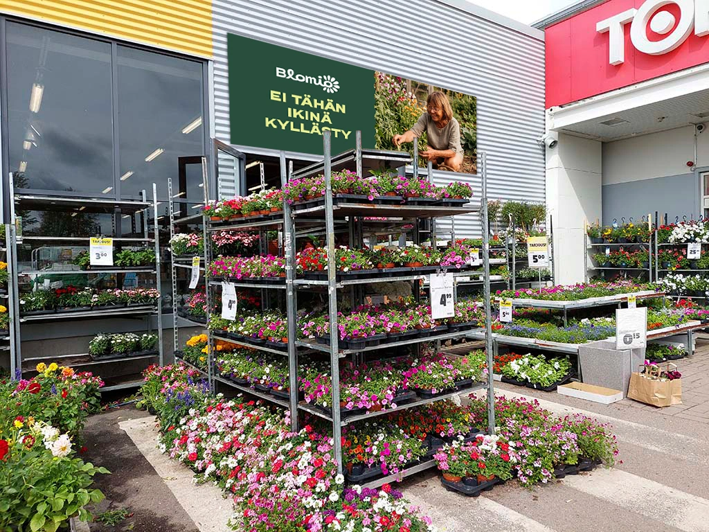
An example of combining imagery, typography and graphics.
Sample visuals
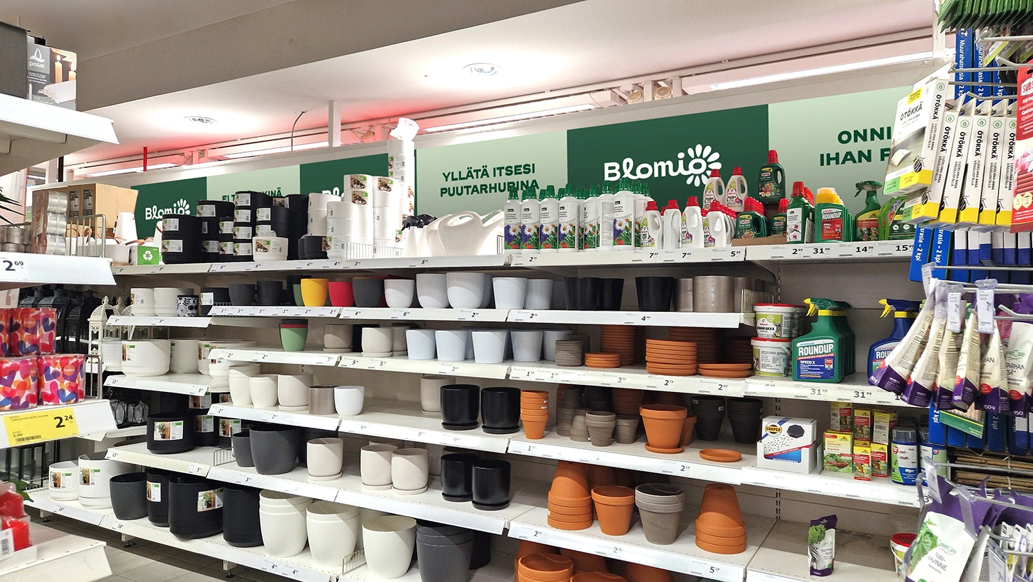
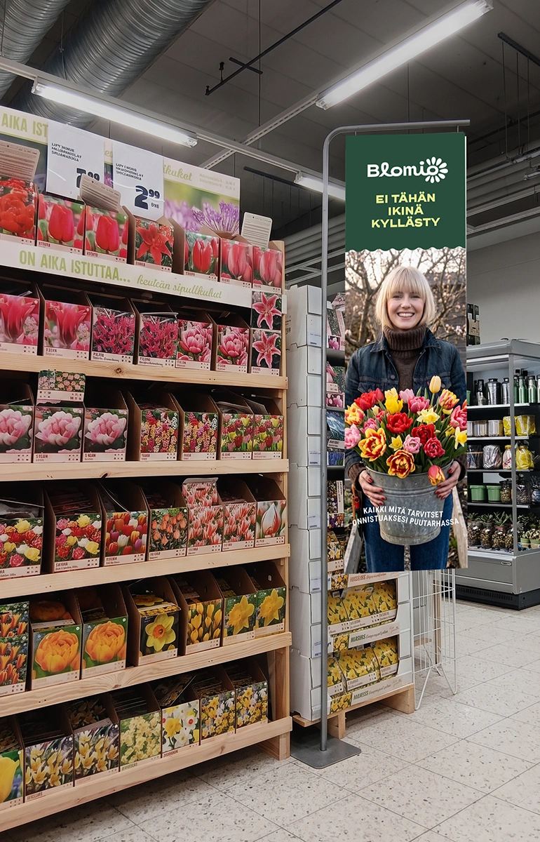
Below you’ll find a few drafts of advertising and in-store materials.
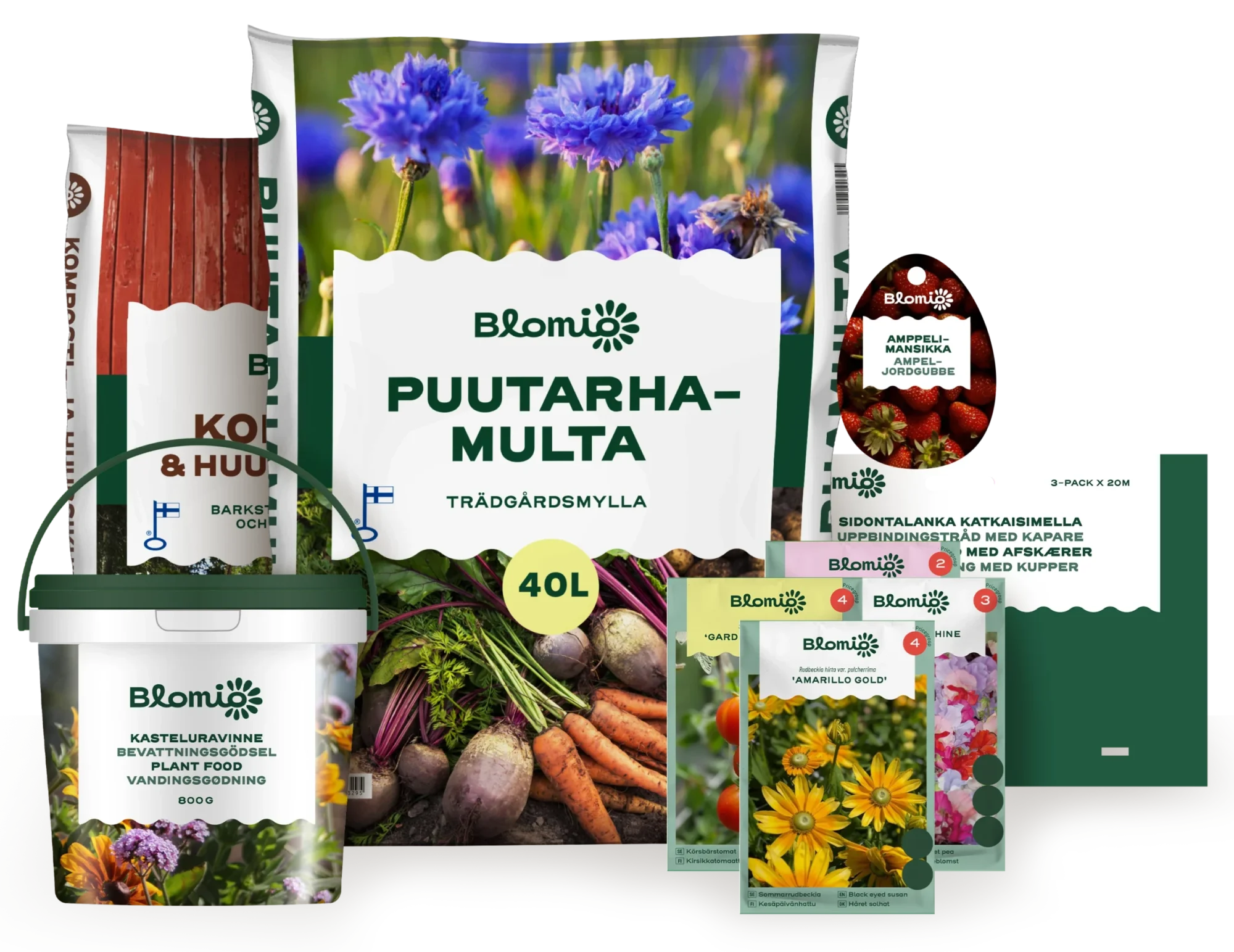
Packaging
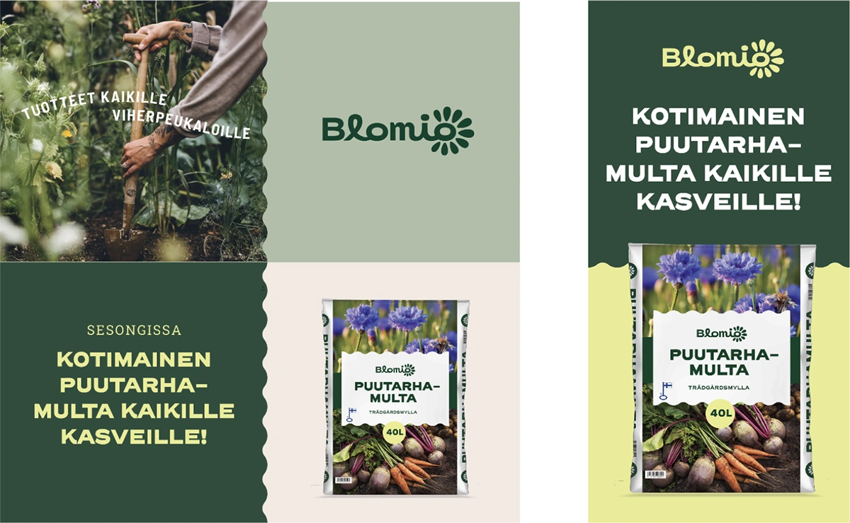
The overall impression of Blomio packaging is harmonious and lively. The brand’s green colour is strongly present on the packaging, making the products feel both modern and approachable at the same time. The overall look of the packaging emphasises ease and professionalism. The photographs convey products that work: we show imagery directly related to how the product is used.
Where needed, different product groups or categories can be distinguished with colour coding.
Video and motion
Like our photography, Blomio’s video is lively, warm and inviting people to get involved. A shallow depth of field supports the soft look and draws attention to the product or detail in focus. Bring small movements into the shot: hands picking, water splashing, leaves rustling, a tool sinking into the soil, flowers swaying. Show the doing, not just the end result.
A video can be made up of a few different shot sizes, or just one delightful moment. The shorter the video, the closer we get to the action.
Example structure, 10–30 sec
Grab attention: A close-up of a plant, harvest, product or hands at work.
Show the product: The product comes clearly into view. The packaging, label or product name should be easy to recognise.
Show the context: A wider shot showing the activity or the setting where the product is used. It can include a person, a hand at work, a finished planting, a vegetable patch, a garden with shrubs, etc.
Leave a lasting impression: The video ends with the Blomio logo and slogan: It never gets old.
Example structure, 5–6 sec
Choose one delightful moment and close it with the logo and slogan, or with the logo and a product image. The product can also appear in the moment itself.
Examples of short videos:
A hand picks a ripe tomato. The Blomio logo + “It never gets old” appear over it.
A person sinks their hands into the soil. A bag of Blomio soil is visible next to them. The Blomio logo + “It never gets old” appear over it.
Close-up of flowers swaying in the breeze. Cut to an end card with the Blomio logo + an image of the flower fertiliser.
Close-up of a vegetable patch where a hand pulls up, for example, a carrot. Cut to an end card with the Blomio logo + images of seed packets.
Pattern
Blomio has a graphic pattern that can be used in marketing materials, on packaging and on products. The pattern is made up of the flower icon and small, vine-like sprigs. The overall effect is organic, cheerful and easily recognisable.
The primary pattern version is a Blomio Green pattern on a BG Green background. Other colour versions may only be used for a good reason.
The primary scale of the pattern is determined by the size of the flower icon. The flower is 11 mm wide, and the pattern should not be used at a smaller scale than this.
Brand
In the Blomio brand guidelines, you’ll find more detailed guidance on the brand’s personality, values, target audiences and tone of voice.