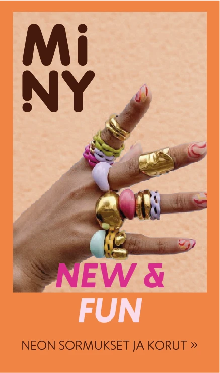
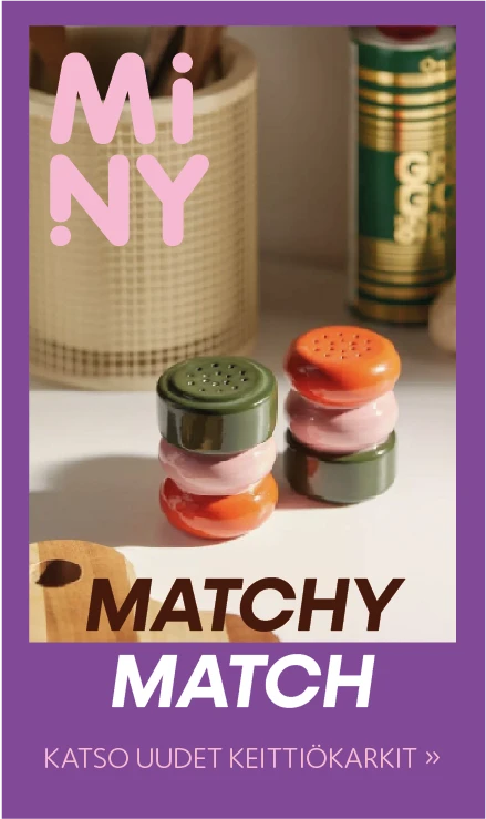
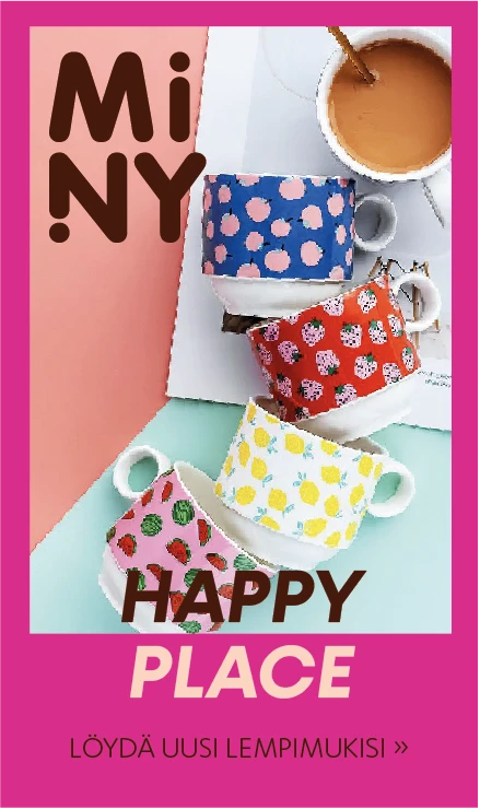
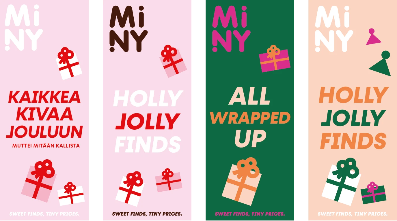
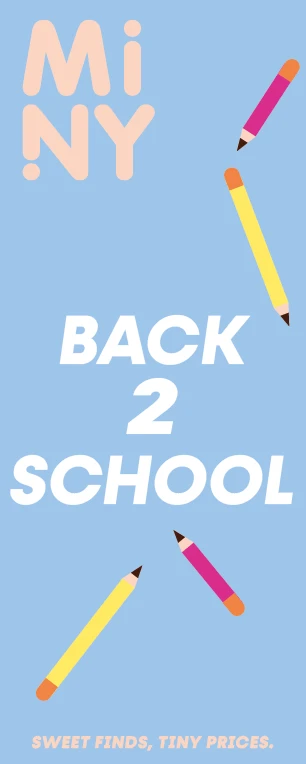
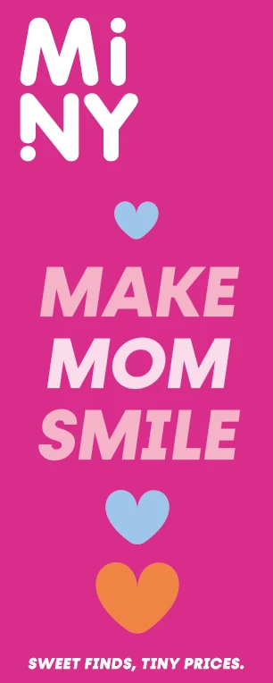
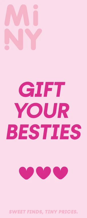
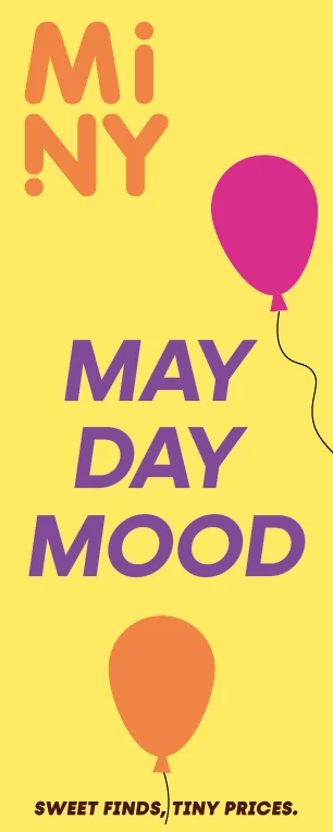
Miny’s visual world is colorful, abundant, playful, and trendy. The look is conveyed through the products, the photographs taken of them, and the graphic identity. The style draws from the so-called “dopamine decor” mindset: an environment that increases joy and energy.
Logo
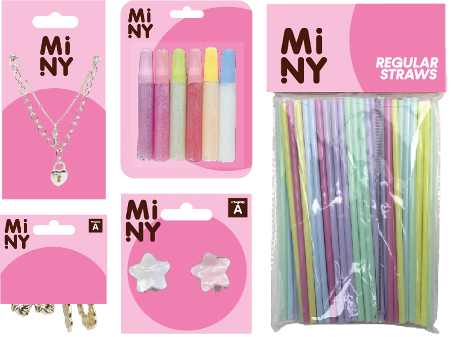
Miny’s primary logo is a text logo placed inside a box. The main colorway for this logo is a brown text logo in a pink box. In addition to the box logo, a standalone text logo is used, which can also function as a more illustrative element. The standalone text logo can be implemented in all Miny brand colors, ensuring sufficient contrast against the background.
The box logo can be placed to bleed off the edge, in which case the safety area does not need to be considered.
Correct use
Colors
Primary colors
Miny’s color palette is vibrant and fresh. The colors include the pink and brown used in the logo, along with seven additional shades. The main focus is on reddish tones. The selection serves as a versatile foundation for various implementations. All new colors can be used in the text logo – keeping in mind visibility against the respective background color used.
Miny brand pink
C0 M40 Y8 K0 sR250 G186 B210 #fabad2 PMS 700C
Miny brand brown
C28 M80 Y90 K75 sR72 G33 B10 #48210a PMS 7596C
Additional & Packaging Colors
Miny Brand Colors
Orange
C0 M58 Y76 K0 sR255 G135 B63 #ff873f PMS 2025C
Hot Pink
C10 M90 Y0 K0 sR243 G44 B152 #f32c98 PMS 212C
Purple
C60 M80 Y0 K0 sR135 G65 B162 #8741a2 PMS 2587C
Yellow
C0 M5 Y70 K0 sR255 G234 B95 #ffea5f PMS 106C
Peach
C0 M22 Y24 K0 sR255 G213 B195 #ffd5c3 PMS 162C
Baby
C0 M20 Y0 K0 sR255 G216 B236 #ffd8ec PMS 2050
Blue
C42 M13 Y0 K0 sR155 G209 B255 #9bd1ff PMS 291
Additional & Packaging Colors
Miny packaging Pink
C0 M35 Y0 K0 PMS 2036C
Miny packaging Hot pink
C0 M63 Y0 K0 PMS 204C
Miny packaging orange
C0 M58 Y76 K0 PMS 2025C
Miny packaging Red
C0 M66 Y42 K0 PMS 4057C
Miny packaging Green
C47 M5 Y42 K0 PMS 6142C
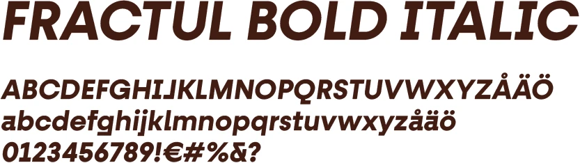
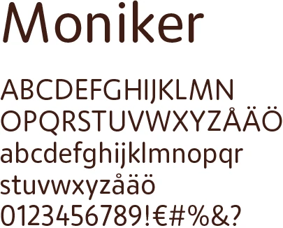
Typography
Fractul – main headlines Moniker – body text
Moniker is used as the body text font and in smaller headlines. Fractul is used in main headlines and key messages. The primary weight used is Fractul Bold Italic (sometimes Fractul Bold). The text is set in uppercase (all caps).
Graphic illustrations can be used in Miny’s campaign materials to emphasize and facilitate the understanding of the theme. Illustrations are produced for specific needs as they arise.
The style of the two-dimensional elements is simplified and clear. Colors are used as solid color blocks; gradients or outlines are not used. Frames are used in materials alongside photographs. In materials without an image, frames are not used.
Campaign Material Colors
Miny’s colors can be used to create different-looking materials, for example, for seasonal Sale campaigns. The same colors should always be repeated across all materials within a single campaign.
For larger campaigns, one additional color fitting the theme can be chosen. Other colors used must be Miny’s own brand colors. Illustrations emphasizing the theme can be introduced into the material.
The illustrations are located in a section of the material bank that requires logging in. You can download them by logging in via the button below. If you need credentials, please contact customer service.
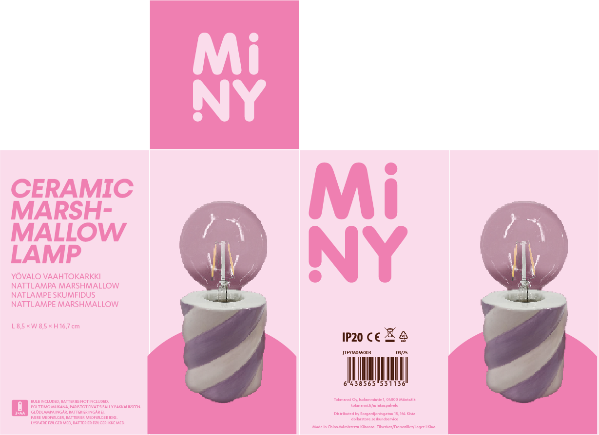
A specific, more limited color palette is used on packaging/product cards.
Pink serves as the base for all packaging. The selected additional color forms the pattern. The orange is the same as in Miny’s brand colors.
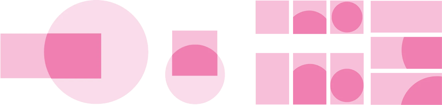
Packaging Patterns
The familiar round shape from the Miny logo is used in the patterning of product cards. The position of the sphere can be altered according to the shape of the material and the product, but a sphere rising from the bottom or placed in the center is considered a recommended position. The color scheme always follows the same formula: the background is pink and the element is in the additional color. Never the other way around.
Color Box Packaging
The sphere element can also be used on color box packaging where the product itself is shown. Note, however, that if the product image is somewhat cluttered for any reason or the packaging has a highly unusual shape, the sphere does not have to be used unless it sits beautifully on the packaging.
Brand
You can find Miny’s story, slogan, tone of voice, and image style in the Brand section.