This guide also contains logo downloads along with colour, typography and visual guidelines. Also provided are some practical examples of how the Kotikulta look and feel have been implemented for marketing materials and on packaging.
Logo
For more detailed guidance on how to use the logo and for downloads (CMYK & RGB), please see below.
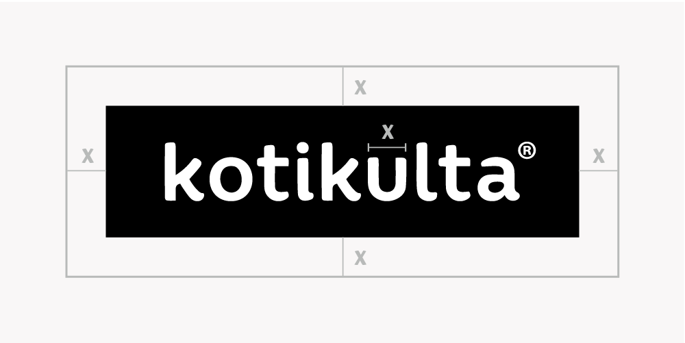
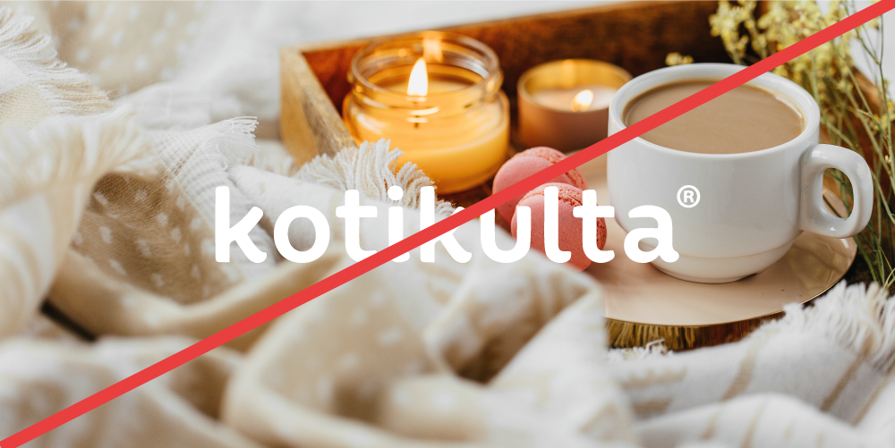
For all backgrounds except black, a minimum clear space equivalent to the width of the letter “e” must be maintained at all times.
If a full black background is used, the black negative space surrounding the logo will create the clear space required.
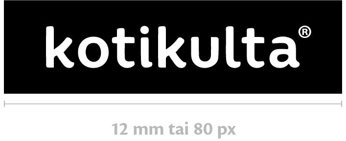
Minimum size
The minimum width for a vertical logo is 12 mm for print and 80 pixels for digital content.
Logo usage
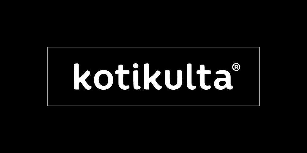
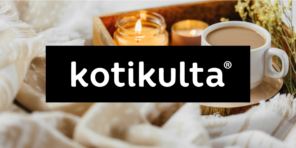
The logo can be set against coloured backgrounds or photographs. Against a full black background, the black negative space around the logo will blend in and “disappear” from view. The word Kotikulta must not be used without the black negative space.
Colors
Primary colors
Black is the Kotikulta primary colour. A black background should be used in all packaging and large scale marketing materials. White text is to be used througout. Alongside the primary colour, a choice of additional colours is available. For more detailed guidance, please see below.
Black
RGB 0/0/0 CMYK 0/0/0/100 HTML #000000
White
RGB 255/255/255 CMYK 0/0/0/0 HTML #FFFFFF
Additional colors
The visual identity of Kotikulta’s marketing materials is complemented and enlivened with colour combinations used as background blocks in both horizontal and vertical layouts. Only the specific combinations listed below should be used, and different combinations must not be mixed together.
As is typical for Kotikulta, black is included in every combination. The accent colour palettes can be used across various product categories depending on the product colours. However, the bedroom and Christmas palettes are tied exclusively to their respective product groups.
General
Black
RGB 0/0/0 CMYK 0/0/0/100 HTML #000000
Beige
RGB 240/216/195 CMYK 2/15/23/5 HTML #f0d8c3
Grey
RGB 184/186/185 CMYK 13/8/11/26 HTML #b8bab9
Grey
RGB 234/230/215 CMYK 3/4/14/8 HTML #eae6d7
Bedroom
Black
RGB 0/0/0 CMYK 0/0/0/100 HTML #000000
Beige
RGB 240/216/195 CMYK 2/15/23/5 HTML #f0d8c3
Blue
RGB 145/171/201 CMYK 28/15/0/21 HTML #91abc9
Grey
RGB 184/186/185 CMYK 13/8/11/26 HTML #b8bab9
Example: Table Setting
Black
RGB 0/0/0 CMYK 0/0/0/100 HTML #000000
Peach
RGB 243/157/107 CMYK 0/48/62/0 HTML #f39d6b
Rose
RGB 255/255/255 CMYK 0/0/0/0 HTML #f9c6b8
Light Tone
RGB 234/230/215 CMYK 3/4/14/8 HTML #eae6d7
Example: Rattan, Plant Pots
Black
RGB 0/0/0 CMYK 0/0/0/100 HTML #000000
Mint
RGB 182/219/199 CMYK 34/0/28/0 HTML #b6dbc7
Green
RGB 124/192/144 CMYK 56/0/55/0 HTML #7cc090
Light Tone
RGB 234/230/215 CMYK 3/4/14/8 HTML #eae6d7
Example: Lighting, Candles
Black
RGB 0/0/0 CMYK 0/0/0/100 HTML #000000
Orange
RGB 250/190/69 CMYK 0/29/84/0 HTML #fabe45
Yellow
RGB 255/229/137 CMYK 0/9/58/0 HTML #ffe589
Grey
RGB 184/186/185 CMYK 13/8/11/26 HTML #b8bab9
Christmas
Black
RGB 0/0/0 CMYK 0/0/0/100 HTML #000000
Pine
RGB 3/118/61 CMYK 100/0/93/29 HTML #03763d
Khaki
RGB 170/168/121 CMYK 34/23/57/0 HTML #aaa879
Mint
RGB 182/219/199 CMYK 34/0/28/0 HTML #b6dbc7
Typography
The Kotikulta typeface is Cronos pro, with regular and bold styles used as appropriate. Optical kerning should be used throughout.
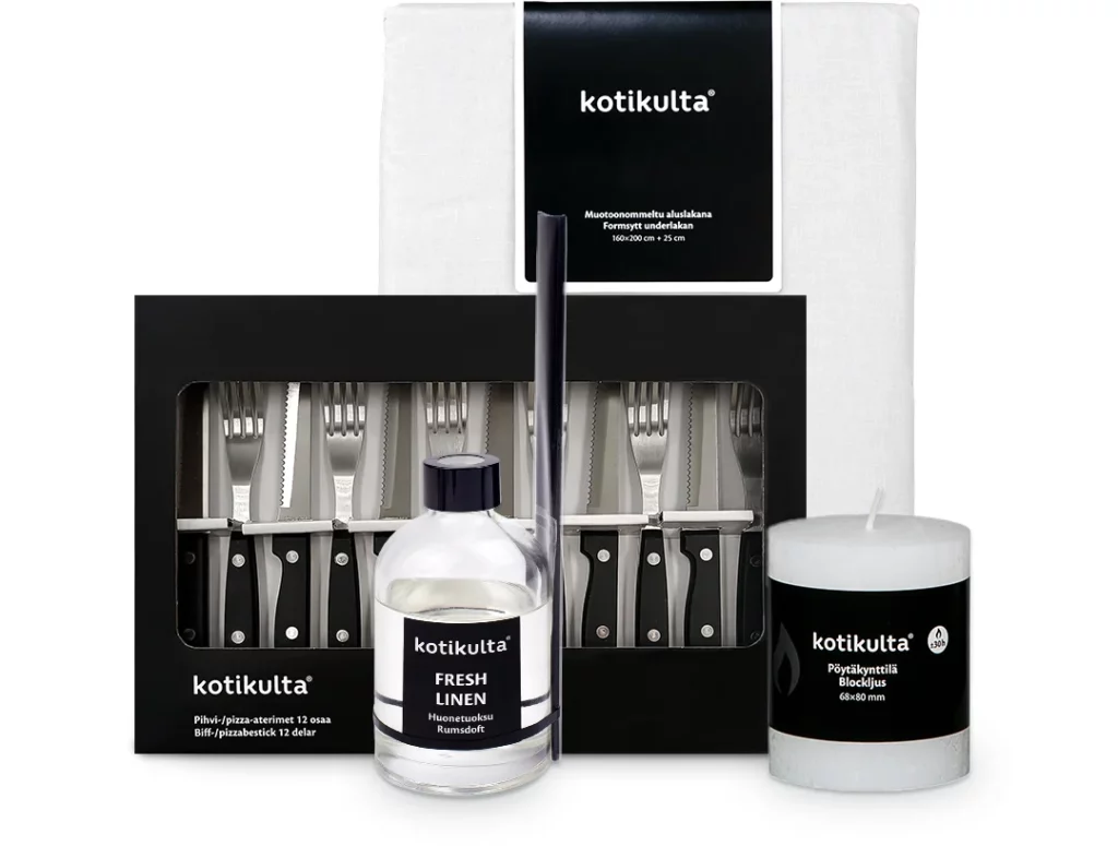
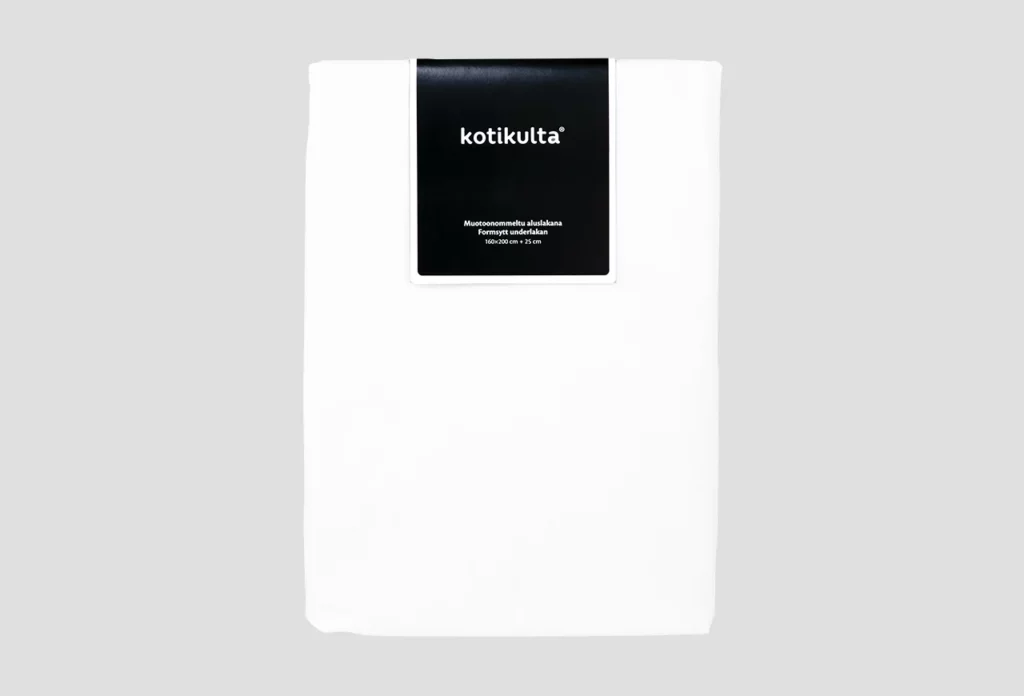
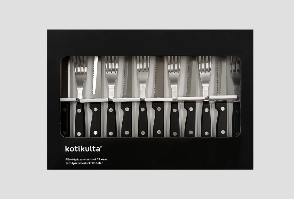
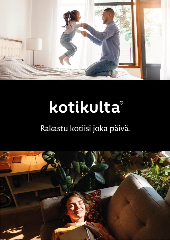
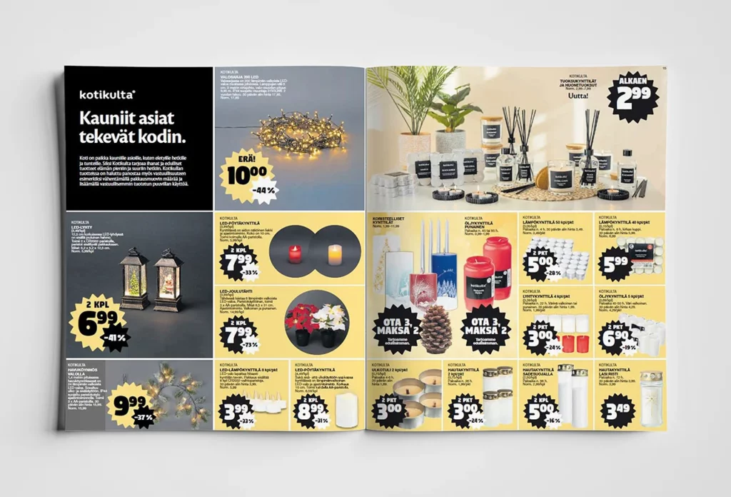
Kotikulta packaging has a simple and uncomplicated look. The logo and other text elements are written in white on a black background. The pared down style allows the products to speak for themselves, creating a cohesive and cost-effective visual identity for the range.
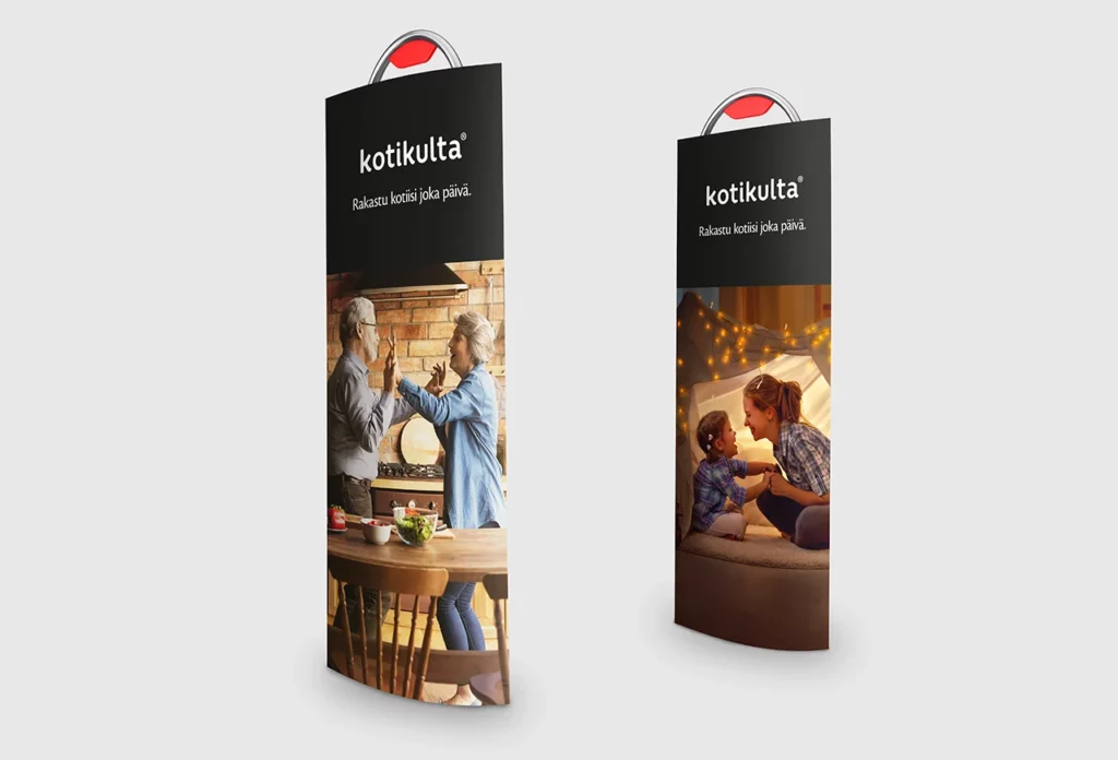
Sample visuals
Packaging examples and sample advertising and point of sale materials are provided below.
Brand
You’ll find Kotikulta’s brand story, slogan, tone of voice and visual style in the Brand section.